Interactive
LandonArcher
Pick a category, tap the things you want, and show the choices as big pictures.
- Role
- Sole designer and developer
- Built with
- HTML, CSS, JavaScript
LandonArcher is a picture choice board. You pick a category, tap the things you want, and the choices appear as large pictures to point to. I built it to support my son’s communication.
The problem
Everyday preferences, like a snack, a fruit or a show to watch, should be quick to show by pointing at a picture. Before, he would always choose the last option he was given. Each choice needs its own familiar picture, big enough to point at. The board had to work on a touch screen and on a computer, by keyboard as well as by touch, and keep the choices at the center of the screen.
What I built
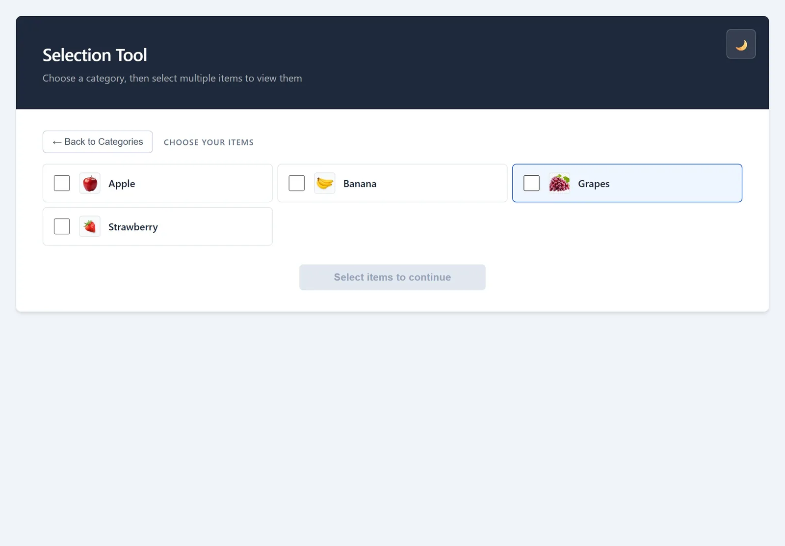
The tool has three views. The first lists the categories as tiles. The second lists a category’s items, each a checkbox with a small picture and a name. The whole row responds to a tap, as well as the box itself, and the button underneath keeps count (“View 3 selected items”). It stays disabled until something is picked. The third shows the chosen items as big picture cards. Tapping one highlights it, so it can be pointed to.
There are 42 items in nine categories, and an item can sit in more than one category. Categories and items sort themselves alphabetically. If a picture fails to load, a placeholder with the item’s name takes its place.
The page has landmarks, a skip link and a heading for each view. A hidden status region tells screen readers about theme changes, selection counts and each change of view. Tiles, item rows and buttons are sized to about 44 by 44 CSS pixels or more. Focus outlines appear for keyboard use only, so a mouse or a finger doesn’t leave rings behind. The light and dark themes come from one set of color tokens, and the styles follow the system’s reduced-motion and high-contrast settings.
Key decisions
Small, with ordinary controls
The tool is one page of plain HTML, CSS and JavaScript. Items are real checkboxes with labels, and navigation uses real buttons, so keyboards and screen readers get the behavior those controls already have. I kept the implementation small so the choices stay central on touch screens and computers alike. The cost falls on the two custom controls, the category tiles and the picture cards, which needed their own handling for Enter and Space.
Move focus with each view
When the view changes, focus moves to the new view’s heading, and the status region says what changed. A keyboard user starts each view at its top, and a screen reader announces where they are.
One list for the vocabulary
Every item is one entry in a list at the top of the script, with a label, a picture file named after it, and its categories. Adding a word means adding an entry and a picture. There’s no editor inside the tool, so changing the vocabulary means editing that file.
A closer look
The first view lists the categories, with Fruit being chosen.
Apple, Banana and Strawberry are checked, and the button reads “View 3 selected items”.
The choices show as big pictures. Tapping Banana picks it out.
The same steps work from a keyboard alone, and focus lands on each new heading, here “Your Selected Items”.
One tap on the theme button switches between light and dark.
How I checked it
For this portfolio I recorded the whole flow on the site, first with a pointer and then with the keyboard alone, in both themes. Focus moved to each new heading as designed. An automated accessibility check (axe, against WCAG 2.2 AA) of all three views, in both themes, flagged nothing. My son uses it day to day.